Decoding Picturebooks: Positioning and Framing

Positioning
—The height of a character on the page often marks their social status or their own self-image:
  • High positioning equates to positive status, favour with other characters or high spirits
  • Characters low down in the page are less confident, afraid, glum or looked down upon

Framing

  • Framed: limited glimpse ‘into’ a world.
  • Unframed: view from ‘within’
Peter Rabbit
The Tale of Peter Rabbit by Beatrix Potter, 1902

Examples:

Poor Peter Rabbit.

By setting the viewpoint low to the ground with restricted vision of Peter’s pursuer, Beatrix potter creates tension for the reader.

The close-up position allows us to feel his fear and desperation. We are not quite under the sieve with Peter, but close enough to see the danger he is in.  The movement of the birds shows us the force of the sieve as it is thrust down upon him.

012
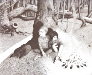
Into the Forest by Anthony Browne, 2005

____


Little Hansel and Gretel are dwarfed by the menacing looking trees in the imposing forest.

The picture is unframed.  We are in the forest with them, looking down at their vulnerable faces.

3999886-4x3-940x705
Where the Wild Things Are by Maurice Sendak, 1963

_____

Max is king.  Although he is physically smaller than the wild thing, his positioning on the grassy mound and their relative postures bring them almost level with each other.

Unlike Hansel and Gretel above, Max is not much smaller than the trees.

Decoding picture books: Colour

Into the Forest by Anthony Browne, 2004
  • —Stuart Hall argued that all texts/images are initially encoded with meaning and then subsequently decoded or read.
  •  —“… we are all inclined to judge pictures by what we know rather than by what we see.” (Ernst Gombrich)
  • We are used to certain graphic codes that allow us to comprehend event and emotions in pictures.

RED – Danger or anger.  Red can also indicate passion.
BLUE – Serenity or sadness.  Blue can also signify coldness.
YELLOW – Happiness, cheerfulness.
GREEN – Peacefulness, or nature.
BLACK – Could mean evil or danger when darkness fills the page.  When worn, black clothes could mean villainous, or a witch. In western societies it could also mean mourning.
PINK – Girlishness.
ORANGE – Warmth.  An orange hue could also show that something is old, like a sepia photograph.
WHITE – Purity. White areas on a page are uncluttered, illuminated.
B&W – Reminiscent of the past, or ‘draining’ of colour.

The Tunnel by Anthony Browne,  1989
The Tunnel by Anthony Browne, 1989

Shades of colour.  Light and bright represents happiness.  Darker shades portray tension or misery.

In the picture above, the forest is dark, grey and made to feel scary by its bleak and uninviting colours.  When Jack returned to his natural state, the sky turns blue, daisies grow and the forest is a greener place. By brightening the colours in the second picture, sense of danger Browne previously created has been removed.

Different hues are associated with different moods or feelings.  Muted colours in Granpa are used to make you feel that he is becoming fragile and the sepia, that he is thinking of the past.

Granpa by John Burningham, 1984

Saturation:  Vibrant colours represent happiness.  Muted colours give a more gentle feeling.

Where the Wild Things Are by Maurice Sendak, 1963

The book below is about the transatlantic slave trade.  Using black and white seems appropriate.   The black and white illustrations capture the despair of these people.  The colour drained from the picture as joy and hope is drained from their lives.

The Middle Passage by Tom Feelings,  1995
The Middle Passage by Tom Feelings, 1995
Hansel and Gretel by Anthony Browne, 1981
The Tale of Peter Rabbit by Beatrix Potter, 1902

Creative use of typeface in picture books

“Images cannot – and must not- be looked at in isolation from the surrounding text” (Moebius)

Words and pcurl upictures compliment each other to create the story, but the words themselves can create further meaning to the story by the use of creative typeface.

Typeface can indicate the playfulness or the seriousness of a book.  The text in this book shows that the book is suitable for young children, and the position of the words, as if the character is shouting them out adds another playful layer to the narrative.

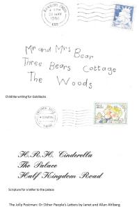
Different colour fonts can complement the images:

Coloured font


Each envelope in The Jolly Postman is written an a way that harmonizes with the story and the characters. Jolly postman

Different typefaces are used for different voices. 

Each character in this book has their own typeface to represent their own voice.  This is a great technique when there is a dialogue between two or more people.  The different types in this books not only compliment the pictures, but they become an integral part of the artwork.

Clarice Bean
Voices in the park by Anthony Browne is a superb example of using different typefaces to represent different characters. (See picture below)
For voice one Browne uses sensible typeface, and a sensible picture for a sensible lady.  For voice two the text is bolder, darker and almost gloomy, like the  picture, to match the personality of the unemployed man feeling low about his situation.  Voice three is a quiet little boy, and the typeface used here is fine, almost fragile.  Finally, voice four is a happy little girl.  Her text is bright and playful.  The picture is quirky and bold.Voices in the park

A Monster Calls – A Novel by Patrick Ness, from an original idea by Siobhan Dowd

  What we are reading – A Monster Calls, by Patrick Ness

 This book is interesting for two reasons:

  1.   It is the first book to win both The Carnegie Medal and The Greenaway Medal.
  2.   The author adapted a story originally thought up by another author;       Siobhan  Dowd.


 Siobhan Dowd wrote in the young adult/teenage category of children’s literature.    Her books ‘A Pure Swift Cry’ shortlisted for The Carnegie Medal in 2007, and ‘Bog   Child’ which won the award in 2009 both deal with controversial, and social realist issues.  ‘A Monster Calls’ is aimed a little younger than a typical Dowd book – which is fine: – Ness was not trying to be Dowd; he was writing her story in his own style.  The result was a book which is deep, dark and intriguing.


 Ness worked in his own style, on a story he adapted in his own way, and let it go in its own direction. Yet it still managed to capture the heart wrenching drama and tragedy of a Dowd book.  Her books can touch teenagers and adults alike and this story is no different. Yes, the book is about a monster-tree.  But this book about a monster-tree DOES deal with serious issues. This book about a monster-tree CAN be taken seriously by adults. Like any Dowd book, it deals with subjects that are hard to deal with:
  
 Illness and death: “I can’t stand it anymore!.. I can’t stand knowing that she’ll go!”
  

 Bullying: “Harry had tripped Conor coming into the school grounds… And so it had begun…and so it had continued.”

 Feeling guilt: the need to be punished: “Why didn’t it kill me?..  I deserve the worst.”
  
 Anger: “TEAR THE WHOLE THING DOWN!”
  
 
 The book also contains three philosophical tales told by the monster-tree.  Each of the three tales has a surprising moral to it.  The conclusions about ethics, intentions, justice and punishment are debatable, and will make the reader stop and think. 
 
 The story is not only told with Ness’s words, but also with Jim Kay’s pictures.  Each picture, scattered with minute detail is not only a superb piece in its own right, but also compliments and enhances the feel of the story.  The illustrations are thicker and darker when Conor is feeling gloomy; light and minimalist when there is hope in his life.  When Conor is feeling under pressure, the drawings engulf the pages and surround the words creating an almost claustrophobic atmosphere.


 This is a thrilling yet moving read, full of twists and irony.  The way the story is told is excellent.  Children will be enthralled within its world of magic and fantasy,   while adults will accept it as realistic and allegorical. The illustrations are dark and detailed; harsh yet elegant.

I wrote this for the library blog as part of Children’s Book Week (1st – 7th October 2012).  The original blog post can be found here