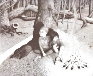
Finishing off…

The teacher said:
Come here, Malcolm!
Look at the state of your book.
Stories and pictures unfinished
Wherever I look.

This model you started at Easter,
These plaster casts of your feet,
That graph of the local traffic –
All of them incomplete.

You’ve a half-baked pot in the kiln room,
And a half-eaten cake in your drawer.
You don’t even finish the jokes you tell –
I really can’t take anymore.

And Malcolm said
… very little.
He blinked and shuffled his feet.
The sentence he finally started
Remained incomplete.

He gazed for a time at the floorboards;
He stared for a while into space;
With an unlined, unwhiskered expression
On his unfinished face.

Allan Ahlberg Heard it in the Playground 1991

The Tailor of Gloucester by Beatrix Potter

THE TAILOR OF GLOUCESTER

In the time of swords and periwigs and full-skirted coats with flowered lappets—when gentlemen wore ruffles, and gold-laced waistcoats of paduasoy and taffeta—there lived a tailor in Gloucester…

chhoose

…”One-and-twenty button-holes of cherry-coloured silk! To be finished by noon of Saturday… Alack, I am undone, for I have no more twist!”

…the poor old tailor was very ill with a fever, tossing and turning in his four-post bed; and still in his dreams he mumbled—”No more twist! no more twist!”

…From the tailor’s shop in Westgate came a glow of light… There was a snippeting of scissors, and snappeting of thread; and little mouse voices sang loudly and gaily…

IMG_4189

…”Alack,” said the tailor, “I have my twist; but no more strength—nor time—than will serve to make me one single button-hole; for this is Christmas Day in the Morning! The Mayor of Gloucester shall be married by noon—and where is his cherry-coloured coat?”

IMG_4191

…But upon the table—oh joy! the tailor gave a shout—there, where he had left plain cuttings of silk—there lay the most beautifullest coat and embroidered satin waistcoat that ever were worn by a Mayor of Gloucester…

…The stitches of those button-holes were so small—so small—they looked as if they had been made by little mice!

IMG_4190

Excerpt from The Tailor of Gloucester By Beatrix Potter 1901.  Full story here.

Photos by taken in Gloucester 2013, Hannah Meiklejohn.

A Manifesto for Children’s Literature; or, Reading Harold as a Teenager: From Philip Nel’s Blog, Nine Kinds of Pie

Through children’s literature we can study how social change and cultural values can determine what is suitable for children, and how books and stories reflect the times in which they were written.
This is a great blog post which illustrates the importance and distinctiveness of children’s literature and its different representations of children’s worlds.

TurtleAndRobot.com

Philip Nel is the author of several books about children’s literature and the director of Kansas State University’s Program in Children’s Literature. He’s also the creator of the website Nine Kinds of Pie, which takes its name from a line in Harold and the Purple Crayon.

He recently published a post that I wanted to share with my readers titled “A Manifesto for Children’s Literature; or, Reading Harold as a Teenager” in which he perfectly expresses all the things I think and feel about children’s books. And, like Nel, I began collecting children’s books as a teenager.

I’ve copied his post below, but I urge readers to check out Nel’s site as well.


Those of us who read, create, study, or teach children’s literature sometimes face skepticism from other alleged adults.  Why would adults take children’s books seriously?  Shouldn’t adults be reading adult books?

View original post 1,086 more words

Decoding Picturebooks: Positioning and Framing

Positioning
—The height of a character on the page often marks their social status or their own self-image:
  • High positioning equates to positive status, favour with other characters or high spirits
  • Characters low down in the page are less confident, afraid, glum or looked down upon

Framing

  • Framed: limited glimpse ‘into’ a world.
  • Unframed: view from ‘within’
Peter Rabbit
The Tale of Peter Rabbit by Beatrix Potter, 1902

Examples:

Poor Peter Rabbit.

By setting the viewpoint low to the ground with restricted vision of Peter’s pursuer, Beatrix potter creates tension for the reader.

The close-up position allows us to feel his fear and desperation. We are not quite under the sieve with Peter, but close enough to see the danger he is in.  The movement of the birds shows us the force of the sieve as it is thrust down upon him.

012
Into the Forest by Anthony Browne, 2005

____


Little Hansel and Gretel are dwarfed by the menacing looking trees in the imposing forest.

The picture is unframed.  We are in the forest with them, looking down at their vulnerable faces.

3999886-4x3-940x705
Where the Wild Things Are by Maurice Sendak, 1963

_____

Max is king.  Although he is physically smaller than the wild thing, his positioning on the grassy mound and their relative postures bring them almost level with each other.

Unlike Hansel and Gretel above, Max is not much smaller than the trees.

INVITATION – Shel Silverstein

English: Signature of Shel Silverstein.


INVITATION


If you are a dreamer, come in.
If you are a dreamer, a wisher, a liar,
A hope-er, a pray-er, a magic bean buyer . . .
If you’re a pretender, come sit by my fire,
For we have some flax golden tales to spin.
Come in!
Come in!


By Shel Silverstein


Related articles


Decoding picture books: Colour

Into the Forest by Anthony Browne, 2004
  • —Stuart Hall argued that all texts/images are initially encoded with meaning and then subsequently decoded or read.
  •  —“… we are all inclined to judge pictures by what we know rather than by what we see.” (Ernst Gombrich)
  • We are used to certain graphic codes that allow us to comprehend event and emotions in pictures.

RED – Danger or anger.  Red can also indicate passion.
BLUE – Serenity or sadness.  Blue can also signify coldness.
YELLOW – Happiness, cheerfulness.
GREEN – Peacefulness, or nature.
BLACK – Could mean evil or danger when darkness fills the page.  When worn, black clothes could mean villainous, or a witch. In western societies it could also mean mourning.
PINK – Girlishness.
ORANGE – Warmth.  An orange hue could also show that something is old, like a sepia photograph.
WHITE – Purity. White areas on a page are uncluttered, illuminated.
B&W – Reminiscent of the past, or ‘draining’ of colour.

The Tunnel by Anthony Browne,  1989
The Tunnel by Anthony Browne, 1989

Shades of colour.  Light and bright represents happiness.  Darker shades portray tension or misery.

In the picture above, the forest is dark, grey and made to feel scary by its bleak and uninviting colours.  When Jack returned to his natural state, the sky turns blue, daisies grow and the forest is a greener place. By brightening the colours in the second picture, sense of danger Browne previously created has been removed.

Different hues are associated with different moods or feelings.  Muted colours in Granpa are used to make you feel that he is becoming fragile and the sepia, that he is thinking of the past.

Granpa by John Burningham, 1984

Saturation:  Vibrant colours represent happiness.  Muted colours give a more gentle feeling.

Where the Wild Things Are by Maurice Sendak, 1963

The book below is about the transatlantic slave trade.  Using black and white seems appropriate.   The black and white illustrations capture the despair of these people.  The colour drained from the picture as joy and hope is drained from their lives.

The Middle Passage by Tom Feelings,  1995
The Middle Passage by Tom Feelings, 1995
Hansel and Gretel by Anthony Browne, 1981
The Tale of Peter Rabbit by Beatrix Potter, 1902

Sailing and magic in 20th century children’s books

Cover of "Swallows and Amazons"

Double Review: Twentieth century novels for Children: Swallows and Amazons and Harry Potter and the Philosopher’s Stone. 

Early realist novel Swallows and Amazons (1930) by Arthur Ransome, and modern fantasy novel Harry Potter and the Philosophers Stone (1997) by J.K.Rowling may seem like unusual novels to review together.  One is seen as prestigious and the other popular.  But what difference does that make to the enjoyment of the two books?

Swallows and Amazons with its maps and compass point locations has a strong sense of place.  Even though the places are given names such as ‘Rio’ rather than their correct names, the reader is aware that the imagined world takes place in the real location of the Lake District. Prestigious realist books often use imagination to stimulate child readers. When swept away in their imagination, the children always slip back into the real world before continuing with their play: “we’ll agree to Rio. It’s a good name”

Swallows and Amazons has a  literary approach to dialogue, plot and characters.  It begins with Roger anticipating a response to a request sent out to their father, one which the reader is not yet aware.  The narrative then takes us back to when they first had the idea to land on “their island”.

When Swallows and Amazons was written it was quite modern for its day to feature gender equality in terms of sailing: the girls were just as good as, if not better than John: “Nancy never looked up, but altered the direction of the boat…” However, the role of the ‘substitute parent’ was adopted not by John, the eldest, but by Susan, who one day woke up “to find the boy pulling at her… [for] ‘something to eat’”

What makes Swallows and Amazons so good?

It pays homage to Treasure Island and Robinson Crusoe.  It creates a very different story using the same island adventure idea.  These stories help the characters play and imagine they are Robinson Crusoe “It’s Man Friday’s Tent”.

Ransome is credited by critics with developing modern children’s literature by challenging what came before.  His characters use modern language and abbreviations such as “Can’t now” rather than the standard middle class English still used by authors at the time Ransome was writing.

Harry Potter and the Philosopher’s Stone is described as fantasy fiction, where the extraordinary can happen and mythical creatures exist such as unicorns.  In children’s literature fantasy allows for greater subtextual meaning. The book has been criticized by some religious organizations for its use of magic yet the story is rooted in older children’s literature making it less controversial that some critics suggest.  The boarding school setting and rivalry for academic excellence and winning the “house cup” give it an old fashioned feel, and fundamentally the story is about good versus evil, with good winning.

Harry Potter and the Philosopher's Stone

 Rowling avoids complex sentence structures and the story has a straight forward narrative. When comparing it against Swallows and Amazons the structure in Harry Potter and the Philosopher’s Stone is simple, child-friendly and starts from the beginning, in a normal world, then moving into his extraordinary adventures.

Harry Potter and the Philosopher’s Stone was shortlisted for the 1997 Carnegie Medal, but was not a winner. It did however win the Nestle´ Smarties Book Prize and other awards where children were involved with the judging process, but failed to win any prestigious prizes judged by adults such as The Newberry Prize.  This prize is awarded for books which contribute to literature.  Harry Potter and the Philosopher’s Stone was blocked for not being brilliantly written, but even though the text is not as literary sophisticated as Swallows and Amazons it has proven popular with children. It has re-engaged both boys and girls with reading, which is by a large degree an important contribution to literature.

What makes Harry Potter and the Philosopher’s Stone so good?

It pays homage to other great works of literature: The boarding school format from Thomas Hughes’s Tom Brown’s Schooldays; and the wizard school from Jill Murphey’s The Worst Witch. There are also various examples of Lewis Carroll’s influence in the book: From falling through the trapdoor, like Alice falling down the rabbit-hole, to the giant chess game, like Alice through the Looking Glass to the riddle with the bottles, like the shrinking and growing potions in Alice’s Adventures in Wonderland.

For child enjoyment, Harry Potter and the Philosopher’s Stone has proven to be very successful.


New Years Resolutions: A poem for children

lazy

Don’t want to work any harder
I want more time to play
I’m going to eat more pudding
I’m going to sing all day

Don’t want to make my bed
I want more rumpled sheets
I’m going to play more games
I’m going to eat more sweets

Don’t want to do more reading
I want to watch more telly
I’m going to wear crazy dresses
I’m going to make lots of jelly

Don’t want to be more active
I want my clothes to squeeze
I’m going to just be lazy
I’m going to do what I please

Creative use of typeface in picture books

“Images cannot – and must not- be looked at in isolation from the surrounding text” (Moebius)

Words and pcurl upictures compliment each other to create the story, but the words themselves can create further meaning to the story by the use of creative typeface.

Typeface can indicate the playfulness or the seriousness of a book.  The text in this book shows that the book is suitable for young children, and the position of the words, as if the character is shouting them out adds another playful layer to the narrative.

Different colour fonts can complement the images:

Coloured font


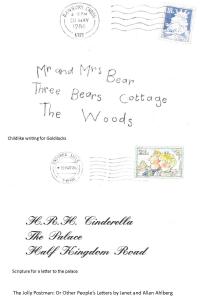
Each envelope in The Jolly Postman is written an a way that harmonizes with the story and the characters. Jolly postman

Different typefaces are used for different voices. 

Each character in this book has their own typeface to represent their own voice.  This is a great technique when there is a dialogue between two or more people.  The different types in this books not only compliment the pictures, but they become an integral part of the artwork.

Clarice Bean
Voices in the park by Anthony Browne is a superb example of using different typefaces to represent different characters. (See picture below)
For voice one Browne uses sensible typeface, and a sensible picture for a sensible lady.  For voice two the text is bolder, darker and almost gloomy, like the  picture, to match the personality of the unemployed man feeling low about his situation.  Voice three is a quiet little boy, and the typeface used here is fine, almost fragile.  Finally, voice four is a happy little girl.  Her text is bright and playful.  The picture is quirky and bold.Voices in the park

Little Red Riding Hood – The wolf and the leer

English: An illustration from Tales of Mother ...
English: An illustration from Tales of Mother Goose by Charles Perrault; translated and edited by Charles Welsh The caption was “”She met with Gaffer Wolf””, it presumably illustrates the tale “Little Red Riding-Hood” and is found as the frontispiece (Photo credit: Wikipedia)

 Double Review: Little Red Riding Hood by Charles Perrault and Little Red Riding Hood and the Wolf  by Roald Dahl

The story of Little Red Riding Hood is essentially a story about an attack on a little girl and her grandmother.  It includes violence, death and sexual connotations (and we read this to kids!).  The vague time and location of ‘Once upon a time…’ signifies to the child that this is a world of fantasy. This means that the child is aware that it is just a story.

Fairy tales began as folk tales for adults but have been used to entertain children since the eighteenth century.  They have been retold and altered according to social and cultural contexts.  In the original folk tale the little girl (unnamed)  is asked by the wolf if she is taking the path of pins or needles – pins representing the temporary binding of a young girl’s garments, and needles representing coming into adulthood, where needles are a permanent bind.  This was originally a tale of initiation as she chose the path of needles.  She later encounters the wolf dressed as her grandmother and gets into bed with him.

In Perrault’s version (1697) the girl who is now nicknamed Little Red Riding Hood, is “the prettiest that had ever been seen”.  Her attractiveness is important because, as is seen later, the story is a warning to women against talking to the wrong kind of men.  She does not escape but instead serves as an example of girls who are spoilt and naive.  She wears red, the colour of passion, which was introduced by Perrault, as a symbol of her ‘sinful’ nature.  She “met old neighbour wolf, who had a great desire to eat her.”  This is the first clue that the wolf is actually a sexual predator.  Perrault turned the wolf into a stand –in for male seducers who lure young women into their beds.

What makes Perrault’s version so great?

– Although this version was not originally intended for children, the repetition the ‘all the better to…’ sequence is a formula that is liked by children.  This has been repeated in every retelling of the story apart from removing some lines such as “the better to hug you with…” for their promiscuity.

– In terms of social anthropology, this is a wonderful example of a 17th century text.  The earliest oral versions of the story include bodily functions “oh, but I’ve also got to make cacka, grandma” and cannibalism “Slut! To eat the flesh… of your grandmother” and also sexual innuendo “undress yourself… come lie down beside me…” which were all removed when Perrault wrote it down.  He altered the story to one that would be suitable for the society he wrote for.

– Let’s face it,  the moral is still relevant: “Children…  should never talk to strangers, for if they should do so, they may well provide dinner for a wolf.  I say “wolf,” but there are various kinds of wolves. There are also those who are charming, quiet, polite, unassuming, complacent, and sweet, who pursue young women at home and in the streets. And unfortunately, it is these gentle wolves who are the most dangerous ones of all.”

Roald Dahl’s version  (1982) begins with the wolf.  Little Red Riding Hood comes into it later when wolf decides that eating Grandma was not enough.  He makes the decision to wait for her with a “leer” which is the first sign of the wolf’s ‘sleaziness’.   This version is clearly aimed at children; the simple rhyming scheme and the humour make it appealing to children. Yet it is still laced with hidden assumptions about Little Red Riding Hood.  She is described in line 27 as the “little girl in red”.  But later, she is referred to as “Miss Riding Hood” with “no silly hood upon her head”.  In France, to have ‘seen the wolf’ was a euphemism for a girl losing her virginity.  Dahl’s Little Red Riding Hood has matured since having ‘seen the wolf’.  She also smiles and takes a gun from her underwear before shooting the wolf dead.  Children only see the humour in this but to an adult she acts quite flirty, and promiscuous.   Dahl has returned the idea of her being a desirable object for the wolf, which is often removed in recent versions. “Compared with her old Grandmamma/ She’s going to taste like caviar.” Her youth makes her more appealing, but it also questions her physical appearance.  Grandma was “small and tough” but by favourably comparing Little Red Riding Hood, one assumes that she would be in comparison, curvy and voluptuous.

What makes Roald Dahl’s version so great?

It is hilarious: “He ran around the kitchen yelping/’I’ve got to have a second helping'”

It is postmodern: “‘That’s wrong!’ cried wolf ‘Have you forgot/to tell me what BIG TEETH I’ve got?'”

She is kick-ass: “The girl smiles. One eyelid flickers/She whips a pistol from her knickers.”

It is illustrated by Quentin Blake